Showing posts with label art of the week. Show all posts

Thursday, 20 October 2011

Art of the Week: 17th Century Dutch

As many of you know, I am an Italianist. Probably always will be. That does not mean, however, that I don't love Northern European art almost as much, because I do! If someone forced me upon pain of death to pick a favorite artist, it would certainly have to be Vermeer. I've recently been realizing how much I like Northern art, especially from the 17th century, because I am a TA for a professor who does 16th Northern (Flemish, I think), and so does the other TA, so they have been slowly working on me. And mocking my Italian ways. For example: we take turns designing lesson plans for sections, and then meeting once a week to discuss them. I keep putting in Italians. So this week:
Professor: [mock dismissive sigh, upon seeing the Pesaro Altarpiece that I'd chosen to start with] what's WITH you and all these Italians?
Me: I have to get them in somewhere.
Professor: I talk about them in class! We did the Sistene Ceiling...last week.
Me: You don't pick any Italians that I like!! [he cracked up]
Later on we decided to keep the Pesaro (as well we should, it's MAGNIFICENT, though he made me cut the Gentileschi) because as he stated, "The Pesaro is a great work of art, not *just* for an Italian, but for art history in general." I think my response was probably, "gee, thanks a lot."

There are a lot of amazing aspects of Northern Art that I sort of knew about but not really, which is why having to sit in on this Art 102 class is so helpful. The fabrics, for one thing. The textural attention to detail, which promotes prolonged looking, means that you have to spend time with these works, to figure them out, to get to know them. My classes get to visit the museum tomorrow, and one of the works we'll be looking at is a Flemish Adoration of the Magi. Two friends and I spent 1/2 an hour in front of it yesterday, just staring at the jewels on the Magis gifts, the gold weave in the cloth, and the lines in peoples hands. (And getting yelled at for being too close. Whoops!)

So here are some works that I've encountered in class or lectures in the past few days. I'm not going to talk too much about them, because if they could be explained by words they wouldn't have been painted. Also, I totally recommend that you check out the Rijksmuseum's website--amazing high resolution photographs of works.

It's a grey day, we're under a wind advisory, and it's been raining straight since Monday. I have cramps, and am cuddled up under a blanket--one major perk about grad school is that if you do not have class on certain days (and Thursdays I don't) you can do a lot of work from the comfort of your bed, in sweatpants. And pretend you are in Belgium, where according to my professor you can "eat leek soup that is about a pound of butter and a pound of cream for every three leeks, and waffles that are dripping with goodness and are the size of your face." Works for me. (And the art ain't half bad, either!)
Vermeer, The Milkmaid (or The Kitchen Maid) c. 1658
I encourage you to open a larger view and look at the milk. And the bread. And the buttons on her bodice. Also, Vermeer painted nail holes in walls, to show where nails had been and then removed. If that doesn't scream "prolonged looking," I don't know what does.
Vermeer, The Love Letter, c. 1669-70
The wall on the left has creepy stains on it. I just went to a lecture on this painting. If you look at it sideways, like as if you were approaching it from an oblique angle, the perspective changes in cool ways.

Judith Leyster, Self-Portrait, 1630ish.
I know this is one of her best known works, but I wrote about it last year, and love it. Her flower paintings are spectacular, as are her human scenes, although those are sometimes a mixed bag. (If peoples cheeks are too ruddy, it annoys me.)
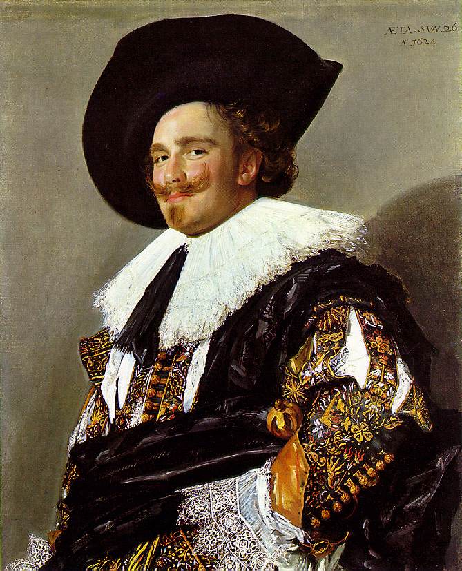
Frans Hals, The Laughing Cavalier, 1624.
We spent some time on this in 102 this week. Is he really laughing? Or is he really just kind of sceptically smirking at us? If you look at the details of his brocaded sleeve (gosh, so gorgeous) you can see little swords and bees. So maybe, he is acknowledging that life is hard, but it is more pricks (beestings) than kicks (like, being stabbed). And that once we acknowledge that, like the Epicureans, we can LIVE. Because it's what we've got, and we might as well live with what we have. (This argument is for anyone who thinks portraiture is just a pretty picture of a pretty person. Although, the lace in this one is so stunning, that I find myself focusing on that.) Frans Hals cheeks are also sometimes TOO ruddy. Am I too picky?


Samuel van Hoogstraten, View of an Interior (or The Slippers), 1654-1662
This is another work which I saw recently discussed in terms of Dutch perspectival inventions. It's a view into another room, and probably would have hung in a hall, giving more dimensions to the hall itself, too. van Hoogstraten is also known for his work with perspective boxes, so there seems to be something about that here too.
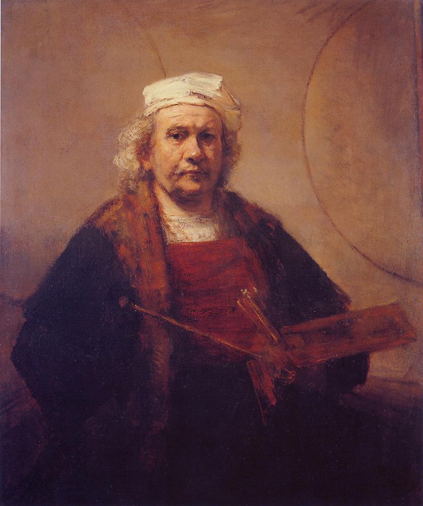
Rembrandt van Rijn, Self-Portrait, 1665-69.
There are entire books about Rembrandt's self-portraits (with good reason!!) and they are probably my favorites of his works, although I do love most of his paintings. Especially this one. He's so frank in his gaze that it makes me sad, the aging artist who grew up in front of his viewers (there are something like 76 known self-portraits that he completed). The circles behind him may represent his artistic skill, the ability to draw a free-hand circle, even at an advanced age. I can't draw a free-hand circle now.
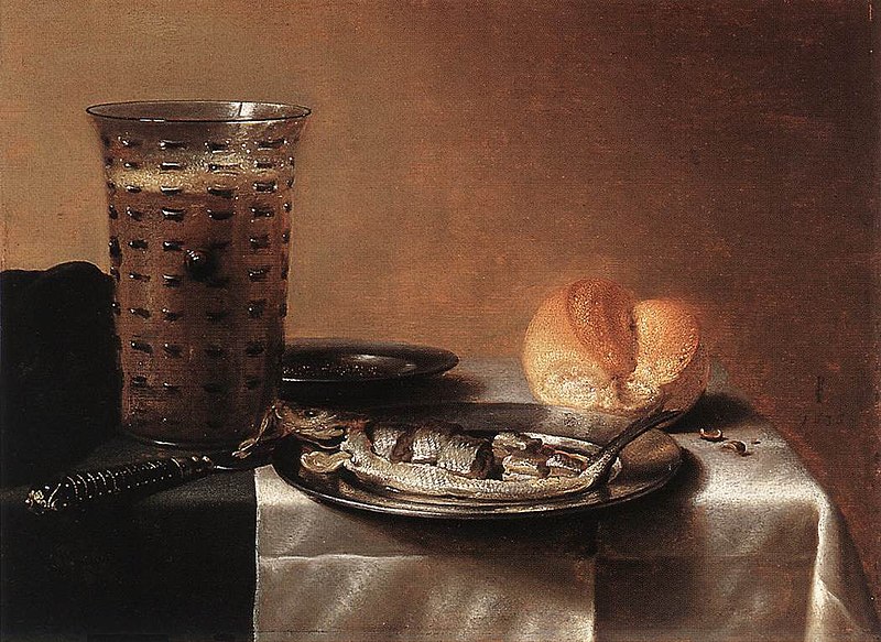
Pieter Claesz, Still-Life with Herring, 1636.
Couldn't end without a still-life! And there are so many more. We looked at this in class. Herring = aphrodisiac. Fun fact.

Sunday, 7 August 2011

Art of the Week: Oceanic Feeling

I've been thinking about the ocean a lot lately, because
1. Shark Week on the discovery channel is just wrapping up, so I've spent a lot of time watching shows about sharks and other ocean dwellers this week with my friends--we even had a Shark Week party, and bought a 6 foot long shark kite to hang from the ceiling. There were cupcakes with Swedish fish on them, and a whole mess of unrelated non-fish themed food. It was pretty excellent. Also, sharks are super smart.
2. My parents and a large chunk of my extended family are going to Cape Cod for the week and I'm pretty envious--I would kill for a crabcake (or several) right now, and I MISS MY FAM!
3. I live in landlocked Indiana, I have an Arabic final in four days, and I want to stick my feet in a sizable body of water.

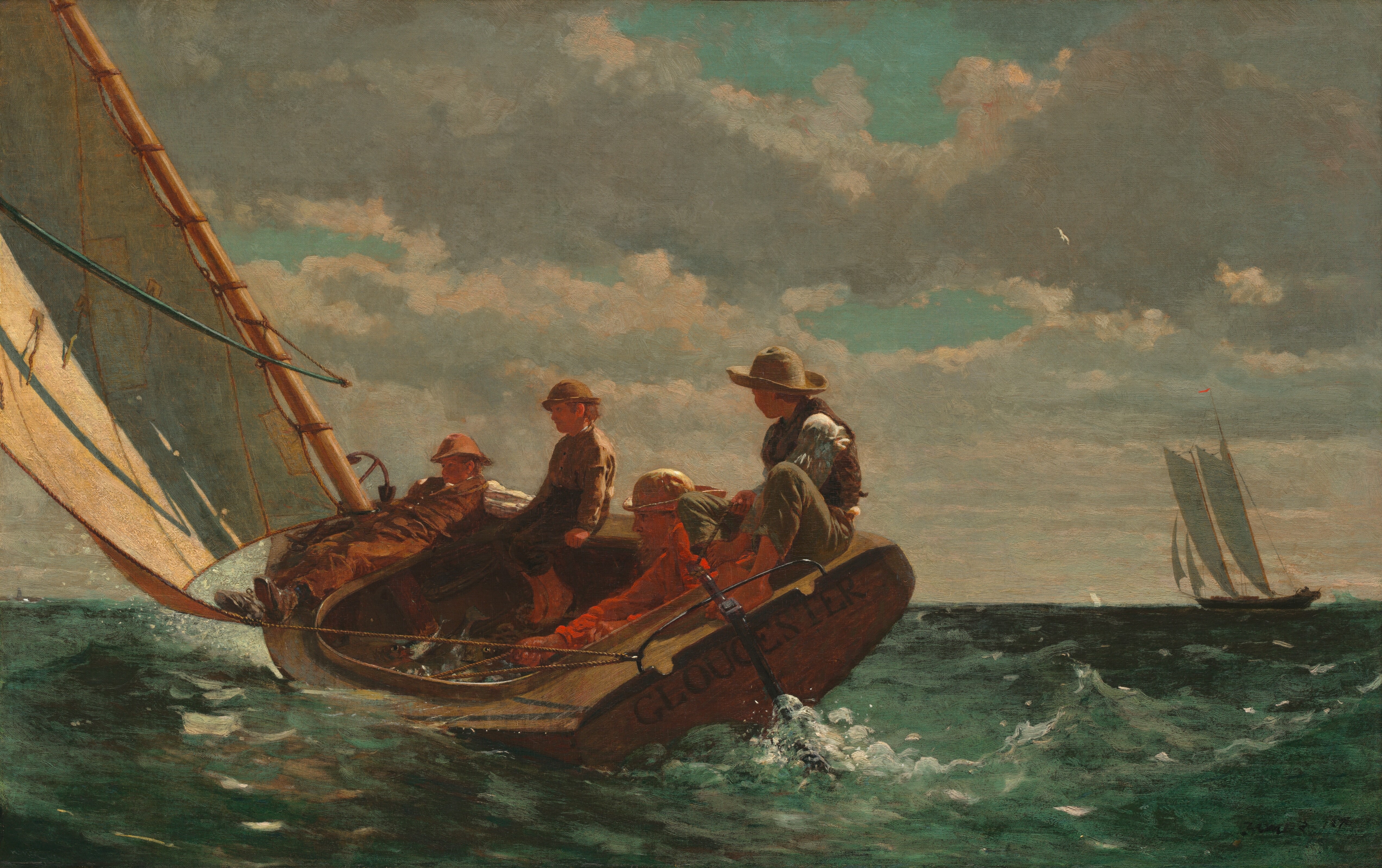
Today's post will be about ocean-themed art by Winslow Homer. If I weren't so weirdly obsessed with 17th century popes, I would switch my art history area to American to study Winslow Homer. He had so many different phases and styles; his watercolors are stunningly gorgeous and his oil paintings are sometimes edgy, or controversial, or poignant. He was a camp artist during the Civil War, and those works are so worth a look. He dealt with slavery, emancipation, nature, veterans, the ravages of war, and New England in all its rocky glory, among many other subjects. Maine was his safe haven and his place of comfort, and many of these ocean works come from that--although he also spent some time in England and the Carribbean, too. Enjoy. I know I did. And if you are curious about these works, we spent a lot of time on them in my Gilded Age class, and I can give you more info if you so desire! (Trust me, I'm not doing him justice here.)Breezing Up (A Fair Wind), 1873-1876. Boys playing at men--learning to be fishermen, which will some day be their livelihood. A game, but a very serious one.

Two Girls on the Beach, Tynemouth (1881) One constant through Homer's work is his interest and concern with current problems of the time--here, for instance, with labor and survival. There were brave men on the sea, but there were also brave women on the shore.

The Water Fan (1898-99). You know what is perfect? The blues in this watercolor are perfect. The Art Institute had this as the front image for a recent works on paper show and one of my friends has a massive poster of it in her apartment. It's pretty awesome.

The Life Line (1884), a work showing the removal of passengers, one by one, from a sinking ship. What is interesting about this painting is that both scholars now and commentators in Homer's time used to write about Homer like he WAS a fisherman, instead of just a painter of them. Did he want to be a fishermen? Did he want to feel helpful and rugged? In any case, he captured people who may not have otherwise been portrayed. Two slightly weird facts about The Life Line: it was bought by a tobacco heiress, and the rope is fraying in the pulley, which just makes it even more dramatic. According to people in the know (ie, my friends), this work is in Philly, and the droplets of water on the rope are worth the price of admission. I don't doubt it.
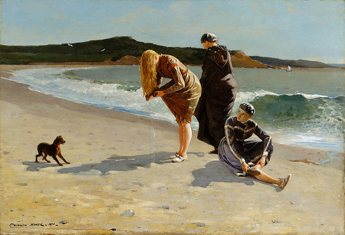
Eagle Head, Manchester (1870) Dog = voyeur, bare legs = scandalous, basically. When this work was printed in a magazine shortly therafter, the legs had been covered up by long bathing costumes and the dog had been replaced by a bathing cap, which amuses me.

Eastern Point Light (1880) Love the monochrome in this work.

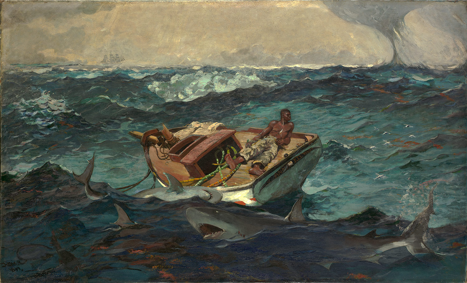
Gulf Stream (1899). I find this work straight up horrifying, but also can't look away. A lot of scholarship deals with this painting, which is located in the Met (and let me tell you, I saw it in March and the blood in the water looks even more scary in person). I think a pretty reasonable interpretation is that this is an allegory of emancipation--the man on the ship has been "freed" but not helped, and now the sharks are coming for him. He is in danger, and though there is a ship far far away on the horizon, it probably will not arrive on time. The cane stalks on the deck of the boat may reference his former status as a slave, and they can't be used to help him. The mast has been completely broken off--he has no sail, no luck, and no chance. And the sharks get closer.

Gloucester Sunset (1880), and the only thing I wrote in my notes about this was "watercolor, STUNNING," which pretty much sums it up!

I leave you now with a work by one of my favorite poets, my super sister Liz.

On the dangers of open water

—to Herman Melville

A foreign beauty dwells in oceans deep.
It traces through the flowing strands of grass
that twine and twirl beneath the rippling glass
of waves, then breaks upon the shore. In sleep
all sailors dream of siren songs that creep
into our heads and drive us to the mast
of any ships (of any size) that pass.
This beauty we don't understand will sweep
us out to sea. We look for it below
our bows, but if we try to understand
the workings of that beauty we perceive,
we're driven mad by all we cannot know.
We force ourselves to roam between the strands
till, like Narcissus, drown to find reprieve.

Saturday, 9 July 2011

Isfahan, Pie, and Saturday Adventures

Another perfect, Midwestern-y, Bloomington-y Saturday. Why? Well, I shall tell you!

We went to the Farmer's Market as per usual and finally, finally, finally PEACHES are here! I got a small basket (there were 9 in it) from a very nice Amish man. I know he was nice, not only because he had a nice smile, but also because two little girls were looking at some peaches next to me and both were holding some rocks (they were probably about 3 and 5 years old). And he said to them, "how would you like to trade one of your rocks for one of my peaches?" and they looked at their dad and he said, "ok," and so they did. Sometimes people make me very happy.

Then we each got a perfect onion (seriously, it is the most beautiful onion I've ever seen), and I got green beans and a small bag of kettle corn, which a couple in plain dress cooks in a big big kettle (well duh) every week. My friends also got local honey, zucchinis, tomatoes, and cucumbers. Then we went to an Indian buffet. There are (I think) 3 Indian restaurants in town and now I have been to all 3. This one is the most cost effective, but not the tastiest. Still and all, though, good naan, good saag aloo, and quite a good variety of dishes for a lunch buffet.

We parted ways, and two of us walked across campus to get to our bus stop. When we got there, there was a woman waiting for the bus who needed to get to Target, but wasn't sure what bus to take, or if she was in the right spot (she was). We got to chatting, and she said she was from Iran and had been here for 4 days. She'll be here for a month before applying for a research visa to start a post-doc in African-American literature here in the fall. She asked me how old I was and when I said 24, she asked if I was married. And I said no (my friend had just taken a phone call so she missed this) and the woman told me that I was too young to get married anyway. "Get your degree first," she said, nodding. "That's what I did with my masters, and then I got married, and had twins. They are 12 now, and back in Iran with their father." She got her PhD in India, teaches in Tehran, and likes studying African-American women, "because we are women, and so we should be feminists. yes?" (we said yes, too.)

We told her we were studying art history, and that we had just taken an Islamic art class and were interested in that. So she started telling us about visiting Isfahan and what it is like now, which was VERY exciting as Isfahan is straight-up awesome. I now pull out my trusty class notebook to tell you that Isfahan was the capital of Safavid Iran from 1590ish-1722 (and is now the 3rd largest city in Iran). It was known as the "pearl of Persia," and is kind of equivalent (except bigger and more awesome) to Versailles in terms of gilt, grandeur, and grandiosity. According to an official chronicler named Iskandar Beg Munshi, "Isfahan is half the world they say/but by saying so, they only go halfway." In other words: once you saw Isfahan, especially in the 17th century, you didn't need to see anything else. Everything else paled in comparison.

Most importantly, images!
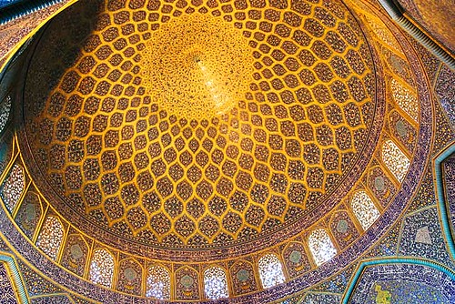
This is the Mosque of Shaykh Lutfullah (1603-1619). This was the second mosque there, and we're not quite sure why there were two. Possibly it was a mosque specifically for women, but it was more likely a private mosque for royals, as a tunnel connected it to the palace. It looks an awful lot like the Dome of the Rock, which very well could have been intentional. It is completely cloaked in blue and gold tile work, and there is stucco-designs on the windows so it looks like stained glass. Some interior shots:
This is the Music Room, or Chini-Khane (China Room), which I believe was located in the palace. This is where the displays of art were, well, displayed. It was a trophy room and proto-museum, which symbolized, through art collecting, the far-reaching power of the Safavids.

Speaking of far-reaching power, this room is one of the "mirror rooms," and it was furnished in Venetian glass. Which, for an Italianist like myself, is pretty exciting! Also, I weirdly just found out there is a Duke Ellington suite called "Isfahan." Check it out here.

Our bus came, and our new friend (whose name we never learned) attempted to get in the back door of the bus, while telling us to "tell the bus driver that I want to go to the Target." So I was on the sidewalk telling her that she wanted the other bus that stopped there, and that it would be there soon, and there were maps on it, and to get in the front door when the bus got there, while my friend tried to stall the bus driver, who CLEARLY saw me, but shut the door and started to pull away. So I had to jog after it and tap on the door and dive on. And then we took seats and dissolved into giggles.

The rest of the day was spent lounging about, having long phone chats with various family members (including my super cousin who got to see Jeter's 3000 hit today in person! most excellent), and making PIE. I love pie. It is (if I had to pick) my favorite dessert. I love how they look, I love the fruit, I love apple pie with cheese and pecan pie with nothing, and I have not, until today, made a pie on my own. One of my best friends from college works in a pie shop, so she was always in charge of them, and both my mother and sister are great at making pies, so I can usually just enjoy the fruits of other peoples labors. Today I did peach (with my market peaches!) and it turned out quite well. It was less runny than I was expecting, although I think I need a remedial lattice making class! Photographic evidence:

Also, if anyone has a foolproof crust making method, let me know it, please. I used refrigerated dough, which is fine, but I'd love to make my own. The problem is that I have about a foot of available counter space, so rolling out doesn't work very well.

So, pie. Summer. Friends. A slight sunburn. It doesn't get much better than that. And if you are interested in more things pie related, check out Pie in the Sky, a Brit TV show from the mid-90s about a policeman who retires to open a restaurant and keep chickens in the backyard but who solves crimes on the side. Or Pushing Daisies, a really great TV show about a piemaker--the dreamy Lee Pace--who owns the Pie Hole pie-restaurant and has the ability to bring the dead back to life for limited amounts of time. He teams up with a private investigator to solve crimes, since he can ask the victims what happened to them. Kristin Chenowith is the waitress. Jim Dale narrates. Delightful. Or Waitress, a sweet and sad movie about pie, babies, abuse, waitressing, and love. To quote Waitress:

"Baby don't you cry, gonna make a pie, gonna make a pie with a heart in the middle/Baby don't be blue, gonna make for you, gonna make a pie with a heart in the middle/Gonna make a pie from heaven above, gonna be filled with strawberry love/Baby don't you cry, gonna make a pie, and hold you forever in the middle of my heart."

Saturday, 2 July 2011

Focus On: Muqarnas

My usual Art of the Week format (which actually happens every, oh, 2 months or so) is to discuss art from the IU art museum. However, as that building is closed for the summer for restoration (because IM Pei is not very good and we have a leaky giant glass roof which is a wee bit of a safety hazard) I am bringing you something very different today: MUQARNAS.
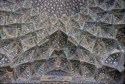
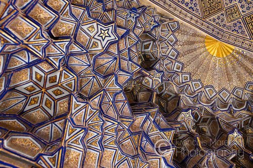
Muqarnas domes are some of the most amazing, awe-inspiring things I have ever seen--and I've never even seen one in person! I first heard of and saw them in my Islamic Survery class last Fall, so most of this info is cribbed from my notes. Muqarnas were the brainchild of the Mongol-Ilkhanids. In my very not-well formed opinion, the Ilkhanids are the most fascinating era of Islamic art. Their dynasty lasted from 1250-1350ish, and they were Mongols who moved into Persia (now Iran) and conquered the land there--but actually, the land conquered THEM, too. They converted to Islam and settled down, bringing some Mongol-nomad architectural styles with them and making them permanent (I almost said "concretesized them," but that is nerdy and I don't think that is even a word!) AND Ilkhanid artists produced stunning stunning stunning manuscripts, because many of the artists were from other areas and the Mongols brought them with them to Persia as war-booty. Hint: I wrote a paper about the Ilkhanids a few months ago. And I totally dig them.But ANYWAY. Muqarnas. In 1275, the summer palace of Takht-i Sulayman was built, and is the only Ilkhanid palace that is currently extant. The building is constructed of circular or octagonal areas, which is weird since those shapes were usually used for mausoleums, but Mongol Yurts (tents) were usually circular, so this may be a nod to their heritage. And found in one of these octagonal areas was a slab, an early blueprint (which is super cool, by the way) of a Muqarnas dome.
Muqarnas means "place of cornices," and is a dome composed of many, many niches. They are often described as faceted, prismatic, or honeycombed--or at least, that is how my professor described them. The woman has a way with words! There are many benefits to a muqarnas dome: they add volume when you need volume (the Ilkhanids liked to make things as big as possible), there are no intrinsic limits in size, and no finite composition, so you could make the structure as big as your resources would let you. The mathematician al-Kashi described it as "a ceiling like staircases with facets". They are almost gemlike in their appearance, like you live in a diamond. I've had a rotating series of muqarnas images as the background on my computer for the past week, as they remind me that this is why I am taking Arabic.

More images!
(I'm not going attempt to identify all of these, as I don't know enough about them all, nor do I trust Google to steer me correctly! I know some are from Isfahan and at least one is from the Timurid Gur-i Mir, but I am not sure about the rest.)

Intrigued? Check out a post that my friend Aleah over at Artgazer wrote a while back about the Gur-i Mir. The Timurids, as you will see, were also Mongol descendents and nearly as interesting as the Ilkhanids--all of those rulers had so much hubris! (Why DO I love rulers with hubris AND their art?? This explains my love of 17th century popes, too.)

Tuesday, 5 April 2011

Focus On: ???

Art of the Week is taking on a different flavor this week, because 1. I am sleepy due to a 7:30 breakfast meeting this morning (at least the food was good!), so the brain is not firing on all cylinders, 2. there is some intrigue about this work, and 3. it'll give you all a chance to be art historians. So without further ado:
We acquired this work in 2006 from a collector who had Hoosier-roots even though he spent the vast majority of his life in Cambridge, MA. It is is listed in our catalogs as by Charles Dana Gibson--late 19th century illustrator extraordinaire, inventor of the Gibson Girl (and by extension: New Women, changing roles of feminists, fashions for young women, the counter example of the Gibson Man, etc), expert social critic and caricaturist, and subject of one on-going paper by yours truly. Except..it's not by Gibson, nor is it of the Gibson Girls, as the registered title would suggest.

So...what is it? The short answer is, we don't know. I have viewed it a few times (you can request a print viewing, which means I get to hang out with my museum-employed friends and look at prints which is awesome) and have viewed it with the works on paper curator and neither of us are the wiser. She had doubts about the attribution for awhile, as the subject matter doesn't seem very Gibson-like--he focused on society women, not immigrant or peasant women like these, even though their faces look similarly lovely, and he did draw servants sometimes. After consulting Gibson's signature on some known works, it confirmed what we already knew--somewhere along the way, the signature was misattributed (and the kind gent who donated the work was known for not having the greatest records of his works, so a dead end there).

Furthermore, we can't figure out what the signature IS. The curator has looked at signature dictionaries (yes, there is such a thing!) with no luck. My American professor rightly (I think) identified these girls as exotic "types," Spanish or Italian, but none of us know if it was created in Europe or America. Or when. The colors in the image are a bit washed out--the greens and reds are more vibrant in person, and really quite lovely. Gibson did do some work in oils and watercolors later in life, even though he is known primarily as an illustrator for Life. It's just a bummer that this work isn't one of his! It would have made my paper a lot cooler, for one thing. At the same time, though, it's kind of refreshing. I'm so used to studying Western art that is identifiable, that finding something new--even something as minor as this--is pretty fun. I just don't know what to do about it.

***
In completely unrelated news, my mom bought me a loveseat over the weekend (thanks, momma!) and it was delivered today and I'm lying on it now, which is making me really happy. I didn't have any real furniture in my living room until now ("living room" being a sort of a loose term as a I live in a studio). Despite being a used loveseat, it doesn't look too shabby! And who would turn down that awesome 1980's gold fringe, really.

Wednesday, 23 February 2011

Focus On: Thomas Eakins

Heads up. I'm deviating from my traditional art of the week format by showing something that is not in the Indiana University Art Museum, but is instead something we looked at in class. Thomas Eakins was a Gilded Age painter, centered, as so many were, in Philadelphia. Probably his most famous work is The Gross Clinic (1875), a portrait of Dr Gross, a widely respected professor at Jefferson Medical College, who is operating on a patient and explaining the process to the doctor-students in the audience. (Sidenote: what is trippin' me out about American art is that we know the NAMES of these people! Like we know who the anesthesiologist was. Of course you know names in older art too, but I'm not used to having so much proof, or at least, proof that I can read..)

Eakins is a tricky artist to explain. Born to an upper class family and French-trained, he seems to have the world handed to him with minimal effort on his part. He lived at the family estate for his whole life and did most of his works not as commissions, but as gifts to people, especially his portraits--he was no starving artist. However, he had some hurdles to overcome, mostly of his own making. He believed that people were waaay too prudish about nude bodies, and that nude modeling was something to be embraced by artists. He believed, in a sense, that artists were like surgeons--his logic being, you would disrobe for a surgeon because it's their job, so there was nothing wrong with doing the same in an art class. Hence, his interest in Dr Gross, dissections, and the medical world.

Eakins was fired from the Pennsylvania Academy of Art in 1886 for a variety of reasons. He believed women should attend nude modeling classes too (good) because he thought women should receive the same training as men (good!) even though he concurrently believed that they could never be great painters (bad). He never asked his students to do things he wouldn't do himself (good), and one day disrobed in front of a class of female students (bad; did not go over well). He exposed himself (bad!!!) to a female student in his office (really bad) because she said she had an anatomical question, and he "showed" her. I honestly think that he saw nothing wrong in his actions, and he didn't understand how those actions would appear to other people. Then you get into the thorny issue of power relations. Did he coerce his female students into modeling, did he do the same for male students, was he just ahead of his time? I think he has been unfairly vilified by some scholars, but I also find his compulsive interest in the body (all bodies--men, women, even children) very disturbing.

Anyway! All this is just a precursor to the real point of this post: Thomas Eakins' later portraits. After his dismissal, he turned almost exclusively to portraiture, mostly of single figures whom he knew, or people whose work he admired, especially scientists and musicians. The majority of these works are, for lack of a better word, melancholy. (For example, see from 1890, Amelia van Buren, Edith Mahon from 1904, or his own Self-Portrait from 1902. An article we read links this to his dejected mental state--that he was inserting his emotions into portraits of others--which I have doubts about because I don't like psychoanalyzing people who can no longer speak for themselves.) Some of the portrayed people disliked the works so much that they had him repaint them, while some went so far as to hide the works in their attic, ala Dorian Grey. Eakins did not gloss over his sitters imperfections. He was, if anything, too honest (because he wasn't being paid for it, so why not?). While his private portraits are introspective, his works of scientists and musicians are much more gregarious. Case in point: The Concert Singer.The Concert Singer, 1890-1892, now in the Philadelphia Museum of Art

The singer depicted here is Weda Cook, a well-known performer who was on friendly terms with Eakins. She is shown here mid-song, in a dress of her own design. I like Eakins' portraits for his details--the hair that curls slightly away from her face, the sumptuous brocaded fabric, and the color coordinated roses (thrown by an admiring fan, presumably) and the conductors arm. The best part of this work, however, is the frame. It's hard to see here, but the musical phrase/aria she is singing is etched onto the lower band of the frame. It is "Oh Rest in the Lord" from Mendelssohn's oratorio Elijah. We know this because Eakins wanted us to know. He designed the frame, which is something that he also did for a scientist-portrait of Henry Rowland (1897).

Weda Cook said that Eakins made her sing the phrase, "Oh Rest in the Lord" over and over so that he could paint her throat right. We decided in class that she was probably on the "Lord" part by the shape of her mouth, but you can decide for yourself! My professor forwarded along some videos of the song, and I think this one is the loveliest sounding, although it is just a still photo instead of a proper video.

So listen to it, and, as my professor suggested, look at The Concert Singer while doing so. And imagine that it is Philadelphia, 1890, and you are seeing this in a concert hall before heading out into the frosty February air for a late supper with friends. You are hungry, but as you listen to Weda Cook in her pink frock, time stops, you forget about dinner, and all you want to do is stare at this woman and hear her song. Eakins, no matter his faults, can give us that vision 120 years after the fact. And that is pretty cool.

Thursday, 10 February 2011

Focus On: Jackson Pollock

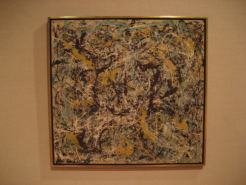
In honor of a pretty nifty documentary I just saw, Who the #$&% is Jackson Pollock? (2006), I bring you the IUAM's (Indiana University Art Museum's) own Pollock, Number 11 (1949).
(image courtesy of Flickr. Number 11 is not this murky in person, but I had trouble finding a better image, so this will have to do.)

Admittedly, I never thought much about Pollock or liked his works--that is, until I saw them for the first time in person. It is the textures that make them really interesting, at least for me. The way he layers paint is fascinating, with the thickness of some lines countered by thin streams of paint. In this work, the dominate colors are a mustard yellow, sky blue, navy, a tiny bit of red, and white. It's an intricate maze, a tangled ball of yarn, a birds nest.

Most times I've been in front of a Pollock, there has usually been someone behind me saying "my five year old could do that," or "how is this even art?" which are opinions often encountered with modern or contemporary art (and one of the many reasons why I started putting in headphones in museums.) There is a formula/saying to use on these people:
Modern Art = I Could Do That + Yeah, But You Didn't.

I defy anyone to paint like Pollock. And "paint" is kind of a loose term here...he flicked and dripped and splattered, carefully. It's much more than painting. Who the #$&% is Jackson Pollock? played at the IU Cinema over the weekend and I went with some friends and it made me happy. (Sidenote: they just redid the Cinema, in the same building as the Auditorium. Free movies almost every night, with Benton murals on the walls. It's a win all around.) Before the documentary was another shorter documentary, 10 minutes long, about Jackson Pollock at his Long Island studio in 1950. It was when he was experimenting with painting on glass, so the camera was underneath and you watched him work from below, which was super cool. The main feature was about a retired truck driver who bought a potential Pollock at a thrift store for $5 dollars for her friend. They both thought it was ugly. Someone told them it might be a Pollock (her response was, "who the [bleep] is Jackson Pollock?" hence the title.) She started contacting art dealer-business people, who were hideous to her. The worst was a man from the Met who was every single stereotype of NYC elitist-Met curator snob-art snob ever. The interviewers asked him about the woman's "Pollock" (and by now the entire audience loved her because she smoked and swore and was sure she was right) and he said something like, "who is she? Nobody. I'm the expert here." After that, every time he was on screen, people booed.

The jury is still out on whether it is a Pollock or not--stylistically it is iffy, but they did find one of his fingerprints on the back. If you are interested in the art business, Pollock, forensics and art, or...truckers, it's worth a watch. So, Pollock. I'm usually pretty glad to see him.

Friday, 21 January 2011

Focus On: Stuart Davis

I haven't done "art of the week" from the IU Art Museum in about, well, two months, so let's bring it back, shall we?

This work by Stuart Davis is one of the largest paintings in the museum and one of the highlights of the Western art floor. Called Swing Landscape, this is the first painting that the museum owned.(Swing Landscape, 1938. Thanks to iub.edu for the image!)

Stuart Davis (1892-1964) was raised in an art-focused Philadelphia family, and at an early age came under the tutelage of Robert Henri, becoming the youngest member of the Ashcan School. (I did a Henri painting for "art of the week" awhile ago--see here.) Swing Landscape is an abstract landscape of Gloucester, MA, a smallish city which seems vibrant, alive, and interesting in this painting. You don't really need to know which city this is, although knowing it is Gloucester, a fishing town, helps explain the water and piers on the left. What is so great about this work in person is how bright and bold it is. You do get a sense of the jazz music that Davis liked, as the buildings and shapes are slightly off-kilter. You can pick out things that might be monuments, or just sections of line, color, and movement that grab you in a certain way.

One reason why I like looking at modern art (which I think this would count as) is that I know so little about it. Often when I'm looking at Western art (especially European, especially from 1550-1700), my brain goes into academic mode, and while I might "get more" out of them, I'm not surprised by what I see, usually. With Swing Landscape, I didn't know anything about Stuart Davis before viewing it for the first time, and that is okay. Sometimes art just needs to be looked at. Perhaps not a profound statement for someone in an art history graduate program, but I stand by it.

But, here is something really cool that I found out. Originally, Swing Landscape was commissioned by the FAP (Federal Art Project), a subsection of the WPA (Works Progress Administration), during the 1930s, and a good way to keep artists a little funded during the Great Depression. Swing Landscape was meant to be hung in the Williamsburg Housing Project in Brooklyn, but for some reason it was sold instead, and we bought it! The Brooklyn Museum has quite a few of the murals which were installed at the Williamsburg Housing Project--I used to walk by them daily to get to my office. (They're in a glass encased corridor on the first floor, back by the sculpture garden, heading to the elevators, in case you're looking for them.) From what I have seen of these murals, they are also abstract, but not based on a specific place, and the colors tend to be more subtle and muted--part of that could be from hanging not in a museum for years, but in a presumably brightly light housing project. Perhaps Davis's was different in style and so was rejected. Want to know more about the murals? Check out the Brooklyn Museum's works here. Want to know about the FAP and Williamsburg, with better images from the Museum's first show of the works? See here.

And thanks to Stuart Davis, for making a grey and snowy week a little less grey for me.

OH, and important blog housekeeping announcement--one of my art history friends has started a blog on ART, where she'll spend the year writing about whatever art strikes her fancy. Check it out here! Like me, she is enamored of the 17th century (although she leans Spanish Baroque while I lean Italian). We both took an Islamic class last semester and also loved that a lot--her post on the Süleymaniye Mosque in Istanbul is especially good. Her blog is now linked in my sidebar. Hooray for art and art historians!

Sunday, 14 November 2010

Focus On: Mucha Lithographs

I haven't done Art of the Week in awhile, so I'll be restart it with a bang, with this lithograph from the IU Art Museum:Alphonse Mucha, advertisement for Monaco, Monte-Carlo, 1897

I have a soft spot for lithography, as my undergraduate institution has a nifty collection (for more on that, check out here.) As they do once a month, the IUAM's print curator pulls a variety of works and opens the viewing rooms for a few hours for people to come and look around. The lithographs she had out were a nice variety--one of my favorites was one from a Berliner Succession art show that had been reused for a few years, so the date had been pasted over. You could see the thumbtack marks where it had actually been hung up. But this Mucha lithograph was what really caught my eye.

I love the stylized nature and clean lines of Art Nouveau prints and posters, and this was no exception. There is a lot going on, but (to me, at least) it doesn't feel fussy. I'm not sure what the spinning floral roundels have to do with Monaco, exactly, but the pretty lady is key to the majority of Mucha's works. Come to Monte-Carlo, he suggests, and this is what you'll see. Who would turn that down? Mucha was Czechoslovakian but did much of his training and work in Paris, which is what we usually think of when we think of Art Nouveau. What is really striking about this work when viewed in person is the richness of the colors (that blue sea in particular) and the gilded aspects--many of the flowers are traced in glittering metallic silver. Lithography, as near as I understand it, is printing using a stone, or more recently, a metal sheet. You don't etch the image onto the surface, but draw it with a waxy or oily substance, and then water is somehow involved, which repels the ink, and then you print it. (Yeah, that was technical, I know.) Anyway, you have to print each color separately onto the work, so you have to be really really really precise. I would imagine that a work of this intricacy would be hard to pull off.

And to show my bias towards Monte-Carlo, here is a bonus art of the week: my kitchen.
Admittedly, I chose that poster because the gent in it looks Lord Peter Wimsey, whom I have a literary crush on.

Tuesday, 12 October 2010

Focus On: Robert Henri & Edith Haworth

This art of the week from the IU Art Museum is a portrait done by an American painter, Robert Henri (1865-1929). I didn't know anything about him until some digging on the internets this morning, and he is a pretty interesting guy! Not related to his art, I suppose, but when he was a child, his father founded two towns, and then got into a dispute with a rancher and killed him and the family had to change their names and go into hiding.

More pertinently, Henri was trained in France, but eschewed Academy education and Impressionism as being too limiting and "academic". An ardent realist, he is now associated with the Ashcan School. He was a long time teacher at the New York School of Art and the Art Students League of New York, where his pupils included George Bellows, Rockwell Kent, Edward Hopper, and Lillian Cotton. What I like about him is that he was a bit of an anarchist and after he was elected to the National Academy of Design in 1906, he often tried to undermine them, and would set up his own, independent exhibitions that were much more egalitarian.

Anyway, all of that is just a precursor to this loveliness:
(Robert Henri, Portrait of Edith Haworth, 1909. Thanks to IU's online database for the image!)

I really, really like this portrait. When you see it in person, it is so LIVELY, which you can tell from this image, too. There is a wonderful quality of movement throughout, stemming from those quick and energetic brushstrokes, especially evident along the sleeve. Somewhere I read that Henri was influenced by Velazquez while studying in Europe, which I could see. Edith Haworth was a former student of Henri's who was moving to France. He painted this portrait of her when she stopped by his studio to say goodbye. I wasn't able to find out much about her, although she is mentioned in quite a few anthologies of American Art.

The best part of this work is Edith Haworth's face. It's got such a personality, which might be her as much as Henri! Her mouth is set in this great half-smile, like he was saying something witty or silly, something that your friend might say if they were painting you to try and make you laugh. She looks indulgently and wistfully towards (presumably) the artist, perhaps sad to be leaving, perhaps excited to start this next phase of her life. She's an enigma. I bet she was fun. I wish I knew her.

Thursday, 30 September 2010

Focus On: Fish Masks

This week I bring you art from the third floor of the Indiana University Art Museum, which houses the African, Pacific, and Greek and Roman galleries. To my mind it is the best, most extensive floor of the museum. And these masks, from Guinea-Bissau, are beyond fabulous:
(Mask in the Form of A Sawfish Head, Bissagos Islands, Guinea-Bissau), and
(Mask in the Form of a Shark Head, Bissagos Islands, Guinea-Bissau)

I don't know enough about African masks to really speak too intelligently about this, but I think it's safe to deduce that masks of fish had particular significance in Guinea-Bissau, as it is located directly on the coast and has island territories. Presumably fish, and the ocean, play an important role in their food/economy. Also (I read on the CIA website) that their dry season is especially bad, at least now, and insufficient water and forest fires are a problem. So it would seem that historically, the sea (and its inhabitants) would be of considerable importance.

What I like the most about these two masks are the sense of fun they express, and the cool use of materials. That is an ACTUAL sawfish snout in the sawfish mask, while the shark head is made of wood, covered with pigment. I like the way the raffia flows from both of them, almost like braids--it reminds me of waves or seaweed.

Friday, 17 September 2010

Focus On: Emaciated Buddha

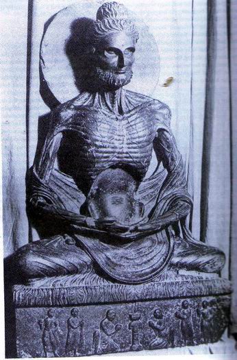
As part of an on-going* theme--Art of the Week from the Indiana University Art Museum! The work this time is an Emaciated Buddha from 2nd century Gandhara. Now, here is the bummer part--this image is NOT the work from the IU Art Museum. I found the correct image on their website, but it seems to be under copyright, so I can't use it. But do check out the link to look for it, because it is a really nice piece.
(Thanks to azibaza.com for the image, which should at least give you an idea of what another Emaciated Buddha from Gandhara looks like.)

The IU Buddha is smaller, and depicts the torso, head, and halo (might be a mandorla, but I don't think it is) of the Buddha. As far as I know, Buddha (Siddhartha Gautama, as he was then) departed from his family's wealthy enclave for a life of aestheticism, as he was looking for a way to find enlightenment. After 6 years (that was the time frame given on the museum label, anyway) Gautama decided that meditation and moderation were a better way to go than straight starvation, and he modified.

Why did I pick this artwork? Because in person the sculptural affect of it is astounding, the way all of the veins, ribs, and disturbing details are rendered. Gandhara would be modern-day Pakistan, Afghanistan, and Northern India, and you can see some of the Greco-Roman/Hellenistic influences in the wavy hair of the Buddha, which isn't as common in Buddhist depictions further South or East. These images of Buddha definitely remind me of Greek icons, which reminded me of something which I learned from watching QI (so it obviously must be true!): companies that make devices to detect people trapped in rubble take samples of the breath of fasting monks, particularly at Mount Athos in Greece, because this is the closest smell to human starvation, which the devices need to be able to pick up.

It's all SO macabre. But I can't help but be interested in ascetic practices and how they play out in art. Like how certain saints are renowned for their asceticism, yet they are often depicted as robust and healthy (cough St Jerome cough cough) . Or nuns who were purported to live on the Body of Christ alone--I mean, it's no wonder they were having visions!! In one of my art class we're looking at diffusion of art styles between "the West" and Islam, so this has been much on my mind lately, and it's cool that you can see that in the Emaciated Buddha.

*"on-going" in the sense that this is the second time I'm doing it.

Saturday, 11 September 2010

Focus On: Käthe Kollwitz

I am kind of surrounded by art thought and art theory all. the. time. now, but one thing I'm not really doing is writing about it. So, what I think I will do is talk about one work a week from the Indiana University Art Museum.

Yesterday I went to a little lecture/tour in the museum's print collection. Prints, unlike most other works of art, can't really be on view most of the time--the paper is really sensitive to light and other conditions, so most of the time, prints are not on view at IU. You can make appointments to see specific works, but they have also decided to open up the space one Friday each month, and lay out about 20 prints on the tables. The curator talks about them, and then you can walk around and look. The theme this month was German Expressionism.

I know a little bit about German Expressionism, because my undergrad institution has some in their collection, but most of it is new to me. There was a strange mix of people for the lecture--some students, but mostly older community members. I met another young woman outside the gallery, and after chatting I know that she doesn't go to IU, is here in town with her fiance, who is a chemistry PhD candidate, she is originally from South Carolina, she used to do lithography and printmaking, and she gave me some winery tips. We were really hoping that they had some of Käthe Kollwitz's work.

And here she is:
(Death, Woman and Child, 1910. Thanks to MoMA online for the image--IU's online images are bad/nonexistent. They are working on it.)

It's a powerful print, made more so by the fact that it is straight-up gorgeous. It's so smooth and modeled and gentle, and it seems like the mother and child are fused together, while some dark, ominous cloud in the upper portion is pulling them apart. If you look very closely, you can see the child's fingers gripped tightly in the mother's hand. It's enough to break your heart.

As my new printmaking friend and I were looking at Death, Woman and Child, an older, elegantly dressed woman came and stood next to us. She began to speak in a lilting German accent. "In my hometown, Cologne, there is a Käthe Kollwitz museum, in one of the cathedrals. Her father was a socialist and her husband a doctor, and they both influenced her art by introducing her to many poor people, who were often her subjects. She and her husband lived in the slums where he treated his patients. Her son died in World War I, and her grandson in World War II." She looked at her hands. "She knew pain. So much pain in Germany, then, yes." She is right. What else is there to say?

Kollwitz commented on living and working in scenes of abject poverty: "It was not until much later...when I got to know the women who would come to my husband for help, and incidentally also to me, that I was powerfully moved by the fate of the proletariat and everything connected with its way of life.... But what I would like to emphasize once more is that compassion and commiseration were at first of very little importance in attracting me to the representation of proletarian life; what mattered was simply that I found it beautiful."

This grieving mother and child, if not a scene that Kollwitz often saw, was certainly something that she would have encountered. And the thing is, she's right--the image is beautiful. And terrible. All at the same time.